Unit 21 M2 responding to feedback

Presentation Pitch

I first created a draft of my pitch which I  presented to my class to allow me to gather feedback on how my presentation can be improved and make my pitch look more professional and easier to read.

for example with my presentation it was hard to read from some distances due to the font size being at 13. The font was then changed from 13 to 18 to be larger to allow it to been seen from all distances from the board.

I was then that i was putting to much text onto my slides which would draw the viewers attention away from me presenting. Therefore to improve my slides i moved to majority of text to make that what i say down to the bottom and summarise the text which is actually on screen.


Proposal

And like my presentation i also created I first created a draft of my proposal which I  presented to my class to allow me to gather feedback on how my proposal can be improved and make my pitch look more professional and easier to read.

Proposal v1 & v2 added header


Proposal v1 & v2 added footer


Proposal v1 & v2 moved table to seperate page


Evaluation of magazine and target audience feedback

The brief I was given was to create part of a document to promote a cultural activity in Manchester. I was asked to create a front cover of a promotional booklet and a double page spread.

Review of final product:


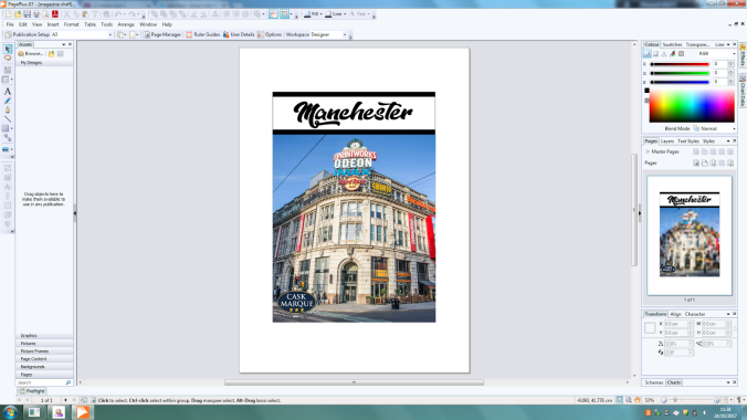
When creating my promotional magazine for Manchester one of my strengths is I made the magazine appropriate to my target market, with the use of such imagery as the Print works which is a place which appeals to students and my target audience. And my font which was used was also suitably chosen due to the stylistic approach of the font and and the hipster aesthetic which occupies it. Along with the cover lines using the same font which stands out well and contrasts well with the images with its white and red colour scheme.

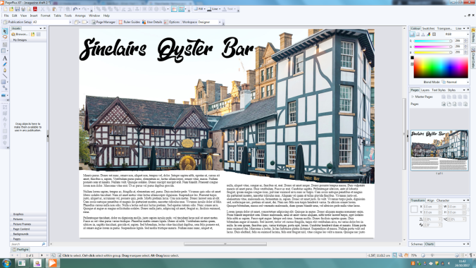
And then through to the double page spread of the magazine as it appeals to the upper band of my target market with Shambles Square. Which in turn allowed for me to promote the culture of Manchester easily due to Shambles Square featuring some of the oldest pubs in Manchester and that has a lot of history in itself. And I also colours which connotes with Manchester United with the red, black and white used heavily on the front cover.And i also used a QR inside to allow for cross media promotion and to allow the reader to carry on finding out more information of the topic.

And with the magazine I used a number of magazine genre codes & conventions.This is shown throughout the magazine through the use of colours, which include that of yellow and red which connotes the Manchester bee and Manchester United. Also all the text used throughout the design is related to street art within Manchester. The cultural aspect I have chosen, together with these connotations help my design appeal to my target audience which is students and young adults. Other ways in which I have helped the design appeal to them is through the language used throughout the main body of text and also the images shown throughout.  Also the design of the magazine is effective in that it is shown to be consistent in the transition between the front page and double page spread. This consistency is created by using similar colours and images in both parts of the design. However I did find issues when creating this magazine as with the  actual images on the front cover due to when I took it, the image is overall a slightly dark image due to the weather. However I did try to improve this by improve the brightness and contrast after the fact, which worked but left a very very subtle grain look to the finished image.

Target audience review:

When I showed the final product to my target audience as final trial before fully releasing my product. The initial impressions was that the magazine was an eye catching product and appealed to them with the front cover and the fonts used on the front cover and withing the actual magazine. Some criticism that was said about the magazine front cover is that it looks slightly cluttered with the covers being spread straight across the magazine from taking up a lot of room withing the actual page. With this feedback if I revisit it I will try to shrink down the font altogether, and get the page cover lines smaller and less cluttered or less find a similar font which will work well but can be read as well but smaller. And one thing they mentioned about the double page spread is that I could add more images of the inside the pubs to show what it looks like. And have more information to the pubs for example use QR codes which link to menus of the pubs themselves down at the bottom near the Facebook QR code.

Page mock-up of magazine

manchester fron page mockup

Front page mock-up:

overall the front page of the mock up works really well with the simplistic nature of the magazine and the bold title in the dope style font which is instantly eye catching and is clear to read,Therefore, when making my final design I will keep this text.  however in my hand drawn page mock up it shows the Manchester eye on the front cover which i could not use in my final design due to the Manchester eye not being in Manchester anymore after its deconstruction in 2015. therefore i had to change it to another very recognizable image in Manchester so i chose the print works due to its well known statues and eye catching imagery.  And with the inclusion of the Cask Marque symbol in the bottom right hand corner also shows what this magazine will also feature so it will go with my market research and to show that i have included feed back on what i should include. The only problem with the mock-up i have is the bare page which doesn’t really have much on it or saying what is being shown inside of the magazine.Therefore in my final product i will add more images to show what you will see inside and add more cover lines into the front cover to explain what you can also see inside.


page mock up double page spread

Double page spread mock-up:

Some of the aspects of this design have worked, such as the title font across the double spread, the font used and the colour of the font which stands out well.  However, other aspects such as the layout of the image and text may need to be changed. The way that they need to be changes is with the image of the two pubs need a touch op to remove all background images such as the crane in the top right corner and the bottom of the image is not straight and messy so i will have to clean that up to get nice and sharp edges. And along with the title is that there are two images of both pubs and this double page spread doesn’t just focus on one pub therefore the name with be changed to “Shambles Square”. And i will also include images from inside of the pub itself so you can see what to expect inside of the pubs. and with the font i would like to add a natural slant onto the words so it flows with the image and looks natural and professional.


M2 – Legal and ethical issues

M2 – legal and ethical restrictions

When considering the legal and ethical issues and restrictions one of the main concerns that will go into my product is to not use any images that are not labelled with fair use and can be reused or edited. This is because if I used someone else’s images without their consent it is seen as plagiarism which isn’t illegal however if it is marked under the 1978 copyright law I or others could be prosecuted due to unlawful use of someone else’s intellectual property; Therefore if I was to use someone’s intellectual property i would have to ask for permission. For example when taking pictures of people I need to ask for permission mainly written to allow it. Therefore I have drew up contracts which are legal documents by you and in this case the person getting photographed which are seen in the eyes of the law as allowance of you to use their likeness in your product. I would also have to get permission of people who own the building I will photograph to allow me to use their property as an image

One thing i must consider with legal issues is the CAP Code ( Non-broadcast code ) which is a set of rulings and regulations created by ASA ( Advertising Standard agency) which when creating a promotional product. For example when i am taking my pictures to make sure i don’t get in any legal issues especially as my promotional magazine is about  the best craft ales in Manchester, it would be best for me not to have any children in the magazine and along with the legal issues along with it. If i was to include them i would first have to get permission of a legal guardian with a Photography Release for Minor Child or Children document.  Along with the CAP Code i must follow the alcohols codes such as :

18.15

“Marketing communications must not be directed at people under 18 through the selection of media or the context in which they appear. No medium should be used to advertise alcoholic drinks if more than 25% of its audience is under 18 years of age.”

therefore when i was doing my research i had to make sure that the audience of the magazine is less than 25% if 18 or younger. to allow me to advertise and allow me to show images of pubs and to talk about best places to go for a drink in Manchester

something else i will have to follow when i am taking pict


And Before taking the pictures for my design a risk assessment and location recce needs to be conducted, assessing any possible risks that may be encountered during the production process and ways to combat these risks to keep the photo-shoot as safe as possible. and due to this the location recce and risk assessment therefore help to reduce the risk of an accident happening. And with the location recce will allow me to see possible risks which need to be added to the risk assessment and give me an idea of what legal documents oi will need to take pictures of buildings or other things i may need in my magazine.

m1- distribution and marketing methods

M1 –  Distribution and Marketing

away i will have to distribute my product, I will have to use a range of cross-media, including social media and flyers which could be a simplified r version of the cultural magazine  One way to distribute the leaflets and flyers is by posting them individually around the Manchester area and have them situated in shops and information desks around Manchester.  and through this allows me to reach a  large percentage of the target audience to have access to them, creating awareness of the content of the magazine.

another way i will distribute is through Social media and will be a larger way to reach my target audience of 18-25 due to the this age group being heavily integrated . This will then will be able to access the magazine, helping to create a larger awareness. Facebook and Twitter can be used to promote the magazine by targeting specific people who they think will be interested in reading it.

With my product of a culture magazine i will have to think of how i will distribute  it to the general public. First of all I will have to come up with a marketing scheme that will promote to my target audience; usually with marketing schemes they usually advertise to a slightly older age as it is seen the younger age(s) aspire to be like them. Therefore a more successful marketing campaign I will be best of adversities slightly older.  Also when marketing the product I should find ways of advertising to a wider audience therefore I could use other publications such as The Sun or the Mirror to advertise I could also use Television to advertise the product. After I have finished marketing the product I will final distribute the product. One way I could distribute the product is selling them in corner shops, I could also have cut down versions of the magazine as samples which are free on buses and around the city centre with basic information and if the general public want to read more they could buy the final product.