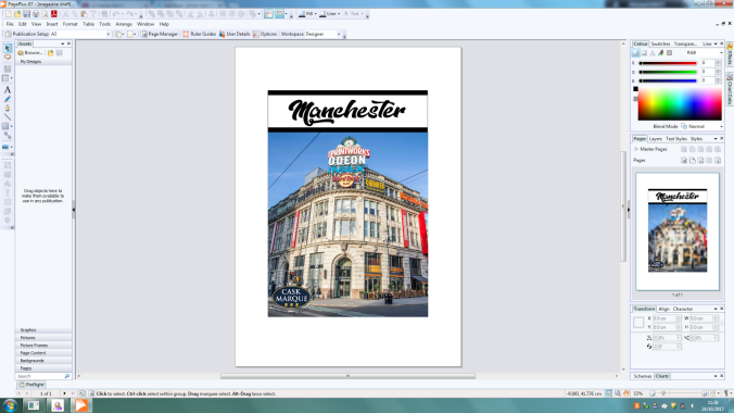
Front page mock-up:
overall the front page of the mock up works really well with the simplistic nature of the magazine and the bold title in the dope style font which is instantly eye catching and is clear to read,Therefore, when making my final design I will keep this text. however in my hand drawn page mock up it shows the Manchester eye on the front cover which i could not use in my final design due to the Manchester eye not being in Manchester anymore after its deconstruction in 2015. therefore i had to change it to another very recognizable image in Manchester so i chose the print works due to its well known statues and eye catching imagery. And with the inclusion of the Cask Marque symbol in the bottom right hand corner also shows what this magazine will also feature so it will go with my market research and to show that i have included feed back on what i should include. The only problem with the mock-up i have is the bare page which doesn’t really have much on it or saying what is being shown inside of the magazine.Therefore in my final product i will add more images to show what you will see inside and add more cover lines into the front cover to explain what you can also see inside.
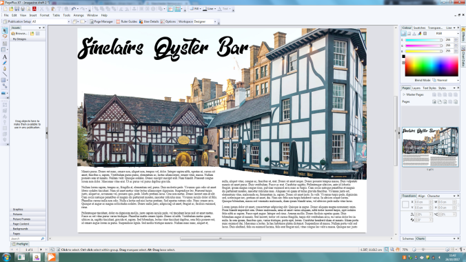
Double page spread mock-up:
Some of the aspects of this design have worked, such as the title font across the double spread, the font used and the colour of the font which stands out well. However, other aspects such as the layout of the image and text may need to be changed. The way that they need to be changes is with the image of the two pubs need a touch op to remove all background images such as the crane in the top right corner and the bottom of the image is not straight and messy so i will have to clean that up to get nice and sharp edges. And along with the title is that there are two images of both pubs and this double page spread doesn’t just focus on one pub therefore the name with be changed to “Shambles Square”. And i will also include images from inside of the pub itself so you can see what to expect inside of the pubs. and with the font i would like to add a natural slant onto the words so it flows with the image and looks natural and professional.
