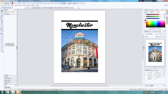
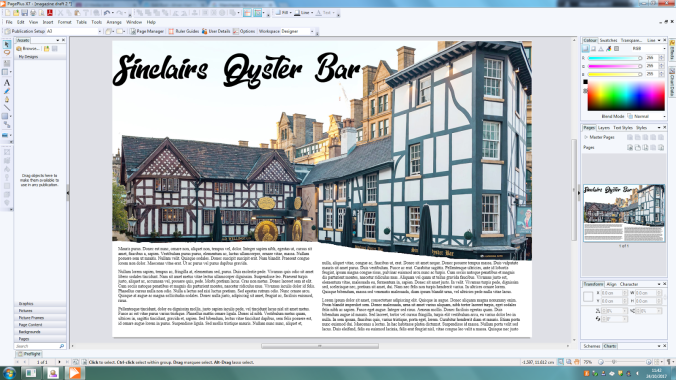
The brief I was given was to create part of a document to promote a cultural activity in Manchester. I was asked to create a front cover of a promotional booklet and a double page spread.
Review of final product:
When creating my promotional magazine for Manchester one of my strengths is I made the magazine appropriate to my target market, with the use of such imagery as the Print works which is a place which appeals to students and my target audience. And my font which was used was also suitably chosen due to the stylistic approach of the font and and the hipster aesthetic which occupies it. Along with the cover lines using the same font which stands out well and contrasts well with the images with its white and red colour scheme.
And then through to the double page spread of the magazine as it appeals to the upper band of my target market with Shambles Square. Which in turn allowed for me to promote the culture of Manchester easily due to Shambles Square featuring some of the oldest pubs in Manchester and that has a lot of history in itself. And I also colours which connotes with Manchester United with the red, black and white used heavily on the front cover.And i also used a QR inside to allow for cross media promotion and to allow the reader to carry on finding out more information of the topic.
And with the magazine I used a number of magazine genre codes & conventions.This is shown throughout the magazine through the use of colours, which include that of yellow and red which connotes the Manchester bee and Manchester United. Also all the text used throughout the design is related to street art within Manchester. The cultural aspect I have chosen, together with these connotations help my design appeal to my target audience which is students and young adults. Other ways in which I have helped the design appeal to them is through the language used throughout the main body of text and also the images shown throughout. Also the design of the magazine is effective in that it is shown to be consistent in the transition between the front page and double page spread. This consistency is created by using similar colours and images in both parts of the design. However I did find issues when creating this magazine as with the actual images on the front cover due to when I took it, the image is overall a slightly dark image due to the weather. However I did try to improve this by improve the brightness and contrast after the fact, which worked but left a very very subtle grain look to the finished image.
Target audience review:
When I showed the final product to my target audience as final trial before fully releasing my product. The initial impressions was that the magazine was an eye catching product and appealed to them with the front cover and the fonts used on the front cover and withing the actual magazine. Some criticism that was said about the magazine front cover is that it looks slightly cluttered with the covers being spread straight across the magazine from taking up a lot of room withing the actual page. With this feedback if I revisit it I will try to shrink down the font altogether, and get the page cover lines smaller and less cluttered or less find a similar font which will work well but can be read as well but smaller. And one thing they mentioned about the double page spread is that I could add more images of the inside the pubs to show what it looks like. And have more information to the pubs for example use QR codes which link to menus of the pubs themselves down at the bottom near the Facebook QR code.


